
As the 2025 deadline for the European Accessibility Act (EAA) draws nearer, we have been working hard to enhance the accessibility of the core Storefront. Over the past few weeks, we have gathered valuable feedback from our customers and accessibility experts to guide our efforts. Our goal is to fully meet the WCAG 2.1 standard.
This article provides a brief overview of the recent improvements. These updates have been gradually rolled out in the latest minor releases. To review all accessibility enhancements, you can enable the 'ACCESSIBILITY_TWEAKS' feature flag. In the upcoming v6.7.0 major release, all accessibility changes, including breaking changes, will become the default.
Let's see what are the major improvements:
Focus states and focus handling
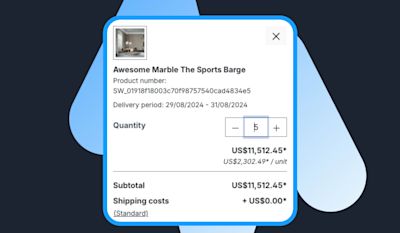
All interactive elements now feature a clearly visible focus state when navigating the page via keyboard. Previously, there were instances where the focus could become "lost," such as after adjusting the quantity of a cart item or opening and closing a modal window. Now, the focus is automatically restored to the previously selected element after actions like reloading the page or closing a dialog. Developers can utilize the 'window.focusHandler' to save and restore focus, ensuring a smoother navigation experience. View the changes in the changelog.
Enhanced keyboard navigation and HTML semantics
We have made significant improvements to keyboard navigation and HTML semantics to ensure a more accessible experience. Users can now navigate the page more effectively using the TAB key, thanks to the enhanced focus states and the transformation of previously inaccessible elements into interactive ones.
Following areas have improved keyboard support and better semantics:
Filter panel
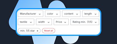
The filter panel now features visible focus states, allowing users to navigate and interact with filters using the keyboard and TAB key. Additionally, the rating system is also operable via keyboard controls.

Pagination:
Pagination has been revamped to use '<a>' elements instead of hidden inputs, making it keyboard-accessible. Previously, this was restricted by the HTML structure. The focus on pagination items now automatically resets after navigating to a new page, providing a smoother user experience.

Language and currency selection
Users can now cycle through language and currency options with improved keyboard navigation. Each option has a clearly visible focus state, making it easy to see which option is selected before finalizing the choice.
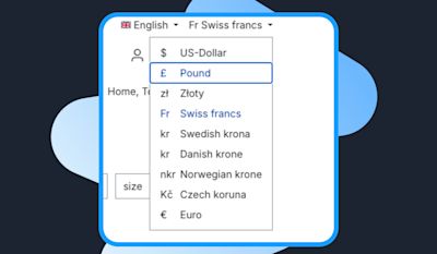
Image sliders and image zoom modal
Image sliders now provide improved keyboard navigation, allowing users to cycle through images using the TAB key. The sliders are seamlessly integrated into the page’s normal TAB order, ensuring smooth and intuitive navigation.
Additionally, the zoom modal can now be operated entirely via keyboard. Users can open the zoom modal by pressing the Enter key and close it using the ESC key. Once inside the modal, they can also cycle through images using the TAB key for a fully accessible browsing experience.
Improved main category navigation
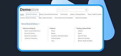
The main category navigation flyout is now now better operates via keyboard, allowing users to easily navigate through categories using the TAB and Enter keys. Additionally, the ESC key can be used to quickly close any open flyout menus, offering a smoother, more accessible navigation experience for keyboard users.
These updates ensure that users relying on keyboard navigation have a more intuitive and accessible experience across the site.
Screen reader support
Filter panel
The product filter panel now offers improved screen reader compatibility, making it more accessible and intuitive. Instead of being announced as "generic buttons," the filter options are clearly identified as a distinct group. Screen readers now inform users that the filter buttons can add or remove filters, and also indicate how many filters are currently selected, providing a clearer and more efficient experience for users relying on assistive technologies.
Improved product, line-item, and order listings
Several list views in the Storefront, including product listings, shopping cart line-items, and account order listings, have been enhanced with proper list markup ('<ul><li>') or corresponding ARIA roles. This improvement allows screen readers to accurately convey the number of items in each list and notify users when the list ends, offering a more structured and accessible browsing experience for those using assistive technologies.
"Icon-only" action buttons and alternative texts
Interactive elements that rely solely on visual icons, such as the wishlist heart button, the three-dot actions button, and the plus/minus quantity buttons, now include alternative text. This ensures that screen readers can clearly convey the purpose and function of these buttons to users.
Additionally, visual elements like rating stars have been updated with alternative text, allowing screen readers to communicate the current product rating, providing a more informative and accessible experience for users relying on assistive technologies.

Improved language and currency selection for screen readers
The language and currency selection feature has been enhanced to provide clearer explanations for screen reader users. It now informs users of the currently selected language or currency, ensuring a better understanding of their choices.
For currency selection, the full currency name is used instead of the abbreviated form, ensuring it is properly communicated by screen readers and reducing any potential confusion. These improvements offer a more accessible and user-friendly experience for those relying on assistive technologies.

Optimized decorative elements and improved wording
Striking a balance between providing essential information and avoiding unnecessary clutter, we've refined how decorative elements and redundant texts are handled for screen readers. Wherever possible, duplicated or irrelevant content is now hidden, ensuring a more streamlined experience for users relying on assistive technologies.
Additionally, text and labels across the Storefront have been improved. For instance, dates are now displayed in a more detailed format for better readability by screen readers. We’ve also replaced vague terms like "Expand" with more specific actions such as "Show details," making interactions clearer and more intuitive for all users.
Enhanced color contrast for better accessibility
We’ve made significant improvements to color contrast throughout the Storefront to ensure better readability and compliance with accessibility standards. Issues such as overly bright help texts have been resolved, addressing previous contrast violations.
Additionally, the alert component has been completely redesigned to enhance visibility. Alerts, including warning messages, now feature sufficient contrast to ensure clear and easy readability, even in critical scenarios. These updates make the user interface more accessible for everyone, especially those with visual impairments.

Enhanced text scaling and readability
To improve overall readability, we’ve increased the default font size to 16px (or 1rem), making text easier to read across different devices and environments.
In addition, all typography now utilizes responsive 'rem' values instead of fixed pixel sizes. This ensures that text scales proportionally based on user settings, enhancing accessibility for those who adjust browser zoom levels or increase font sizes.
We've also upgraded the administration text editor to output proper '<p>' elements instead of '<div>', ensuring more semantic and accessible markup, further improving the user experience for assistive technologies.

Skip to Main Content
Users can now directly skip to the main content, bypassing navigation elements, for faster and more efficient access to key information.

Enhanced Form Error Suggestions
Default storefront forms now offer clearer and more helpful suggestions when a field error occurs, providing users with precise guidance to correct mistakes more easily and complete forms smoothly.
Automated Accessibility Testing
To maintain the stability of our accessibility enhancements, we implement automated testing to ensure compliance with accessibility best practices and proper HTML semantics. Our acceptance test suite includes AXE core accessibility checks, evaluating conformance to WCAG 2.1 AA standards as well as established best practices.
Additionally, we leverage Google Lighthouse to achieve a perfect accessibility score of 100, reinforcing our commitment to delivering an inclusive platform for all users.
Next Steps
Although we have addressed the most critical accessibility issues with this epic, improving accessibility remains an ongoing focus for us. We will continue to work on optimizing accessibility over time, ensuring that our platform meets the highest standards.
Find out more about Shopware and digital accessibility here
Blog article: Online stores must be accessible by 2025 – Here’s what you need to know
Shopware documentation for developers (including ticket overview)

